Covers
Covers are an annoying certainty of writing novels. Everyone will tell you ‘don’t judge a book by it’s cover’, but you know what’s going to determine whether people will give my book a second glance? More than reviews, more than testimonials, more than bestseller stickers? The cover. Any ads, pop-ups, or product placement is entirely dependant on the cover catching people’s eyes, as well as their attention.
As some of you may have seen, I’ve been through a few covers already for my upcoming novel ‘The Whispering Depths’.
It all started with this:
Cover 1
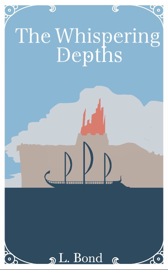
My first cover design. Some of you might remember this, it was all over this website and the amazon product page for quite a while. I wanted to evoke a stylised silhouette look, especially drawing influence from Greek pottery and artwork.
This first attempt, while not terrible, left quite a bit to be desired. It was simple, and that in itself had a sort of charm, but it was unpolished. The colours were pleasing but wholly uninteresting, and did not draw the eye.
This lead to my second design:
Cover 2
I know. Yikes! I aimed for a darker colour scheme, and a more dramatic composition. As you can see, it failed miserably. It’s overcrowded, the colours blend into a homogenous blob, and the white of the ship is too out of place.
It did, however, provide me with many of the elements I would use in later covers. The silhouettes of the serpent and sea, in particular. I coloured the serpent’s eye the same colour as the city, showing that both the masters and the snake are two sides of the same coin. You’ll see that I kept this detail throughout all the covers. It shows that both the master and serpent are domineering, controlling presences that seek to crush Arno, and to own him. This plays well into the theme of control and power that plays out through the story.
This brings us to the third design:
Cover 3
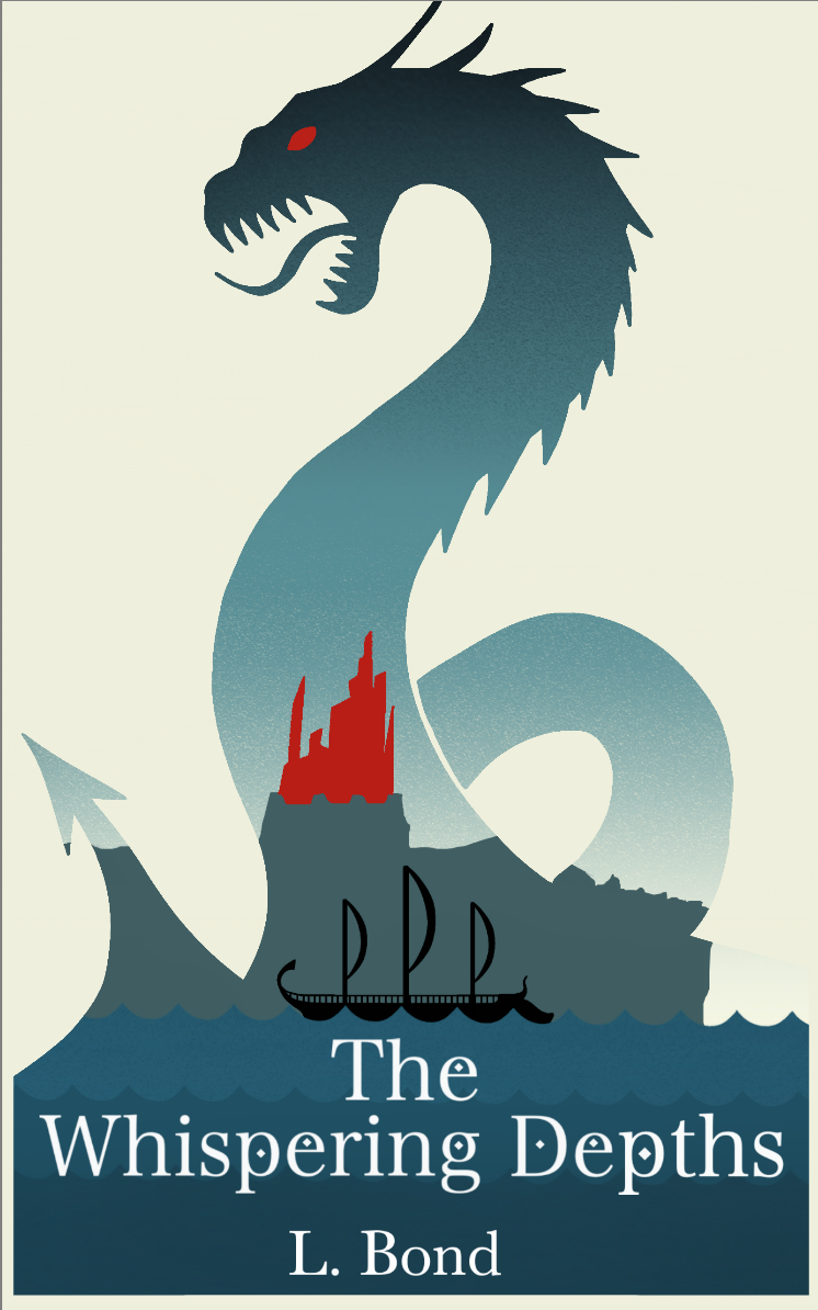
This was a drastic improvement over the previous attempt. It did away with the monotonous sky and gave it a lighter quality, much needed as cover 2 was far too dark, steeped in hues of dark aqua. While this cover keeps the same basic palette, it utilises the colours in subtle, yet markedly improved ways, such as deeper reds, and a clearer distinction between the sea and sky.
There was some debate as to whether the background should be black or white. I preferred white honestly, though it did give it an unfinished look, as if I were yet to fill in those sections. To remedy this I tried several shades of eggshell and cream, ultimately settling on a shade that would blend with the lighter section of sky. I think this cover is far more attention-grabbing, and gives a lighter tone to the overall composition.
Another key difference is framing the entire cover within the silhouette of the serpent. This allows me to have both the snake and the city without having to crowd them both on the same page like in cover 2.
Finally, we have our fourth design.
Cover 4
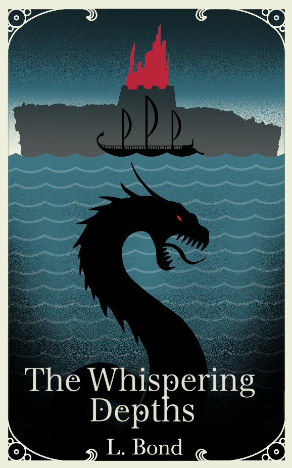
This cover was quite contentious. On every poll everyone seemed to agree that covers 3 and 4 were the best designs, however which was superior seemed an unanswerable question. For this design I segmented the page into thirds, each representing a significant aspect of the story. The lower two thirds are dominated by the sea and serpent, showing the menacing creature lurking in the deep. The top third, above the waves, is dominated by the looming silhouette and aggressive red of the city, showing the masters and their ceaseless pursuit of Arno. Caught between these two threats is the ship.
This cover speaks to me more thematically, if not aesthetically.
-
So those are the four designs. Let us know which you prefer, what speaks to you, what doesn’t. Who knows, maybe we’ll use both 3 and 4 for a digital and paperback run.
But that’s all from me for now, subscribe below to stay up to date, and keep an eye on the blog for exclusive previews, news, and updates.
Thanks for reading!


